Sushi Square
In London, there’s a small restaurant that has quietly built a loyal community over more than ten years. Sushi Square has history, pride, and a deep love for what they do — but the brand no longer reflected the energy or care that people felt when they walked through the door. They needed a refresh that honoured their heritage while giving them the clarity, confidence, and visual presence to move forward.
Client: Sushi Square
Deliverables: illustration, identity, packaging, merch and creative direction


Logo mark colour variations
The brief was to revitalise the brand through identity, packaging, illustration, and merch — a full system that could bring cohesion back to the restaurant. What excited me most was the opportunity to create something that felt modern and expressive without losing the warmth and familiarity that long‑time customers loved.
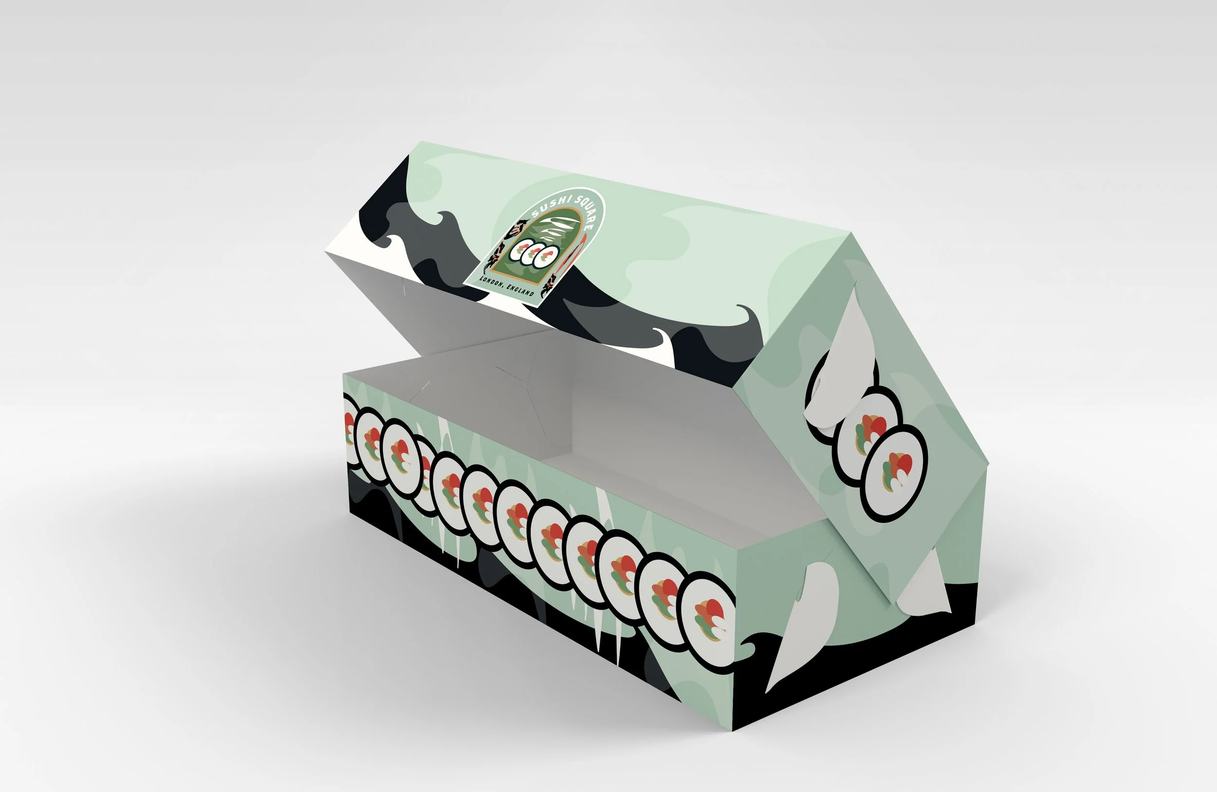
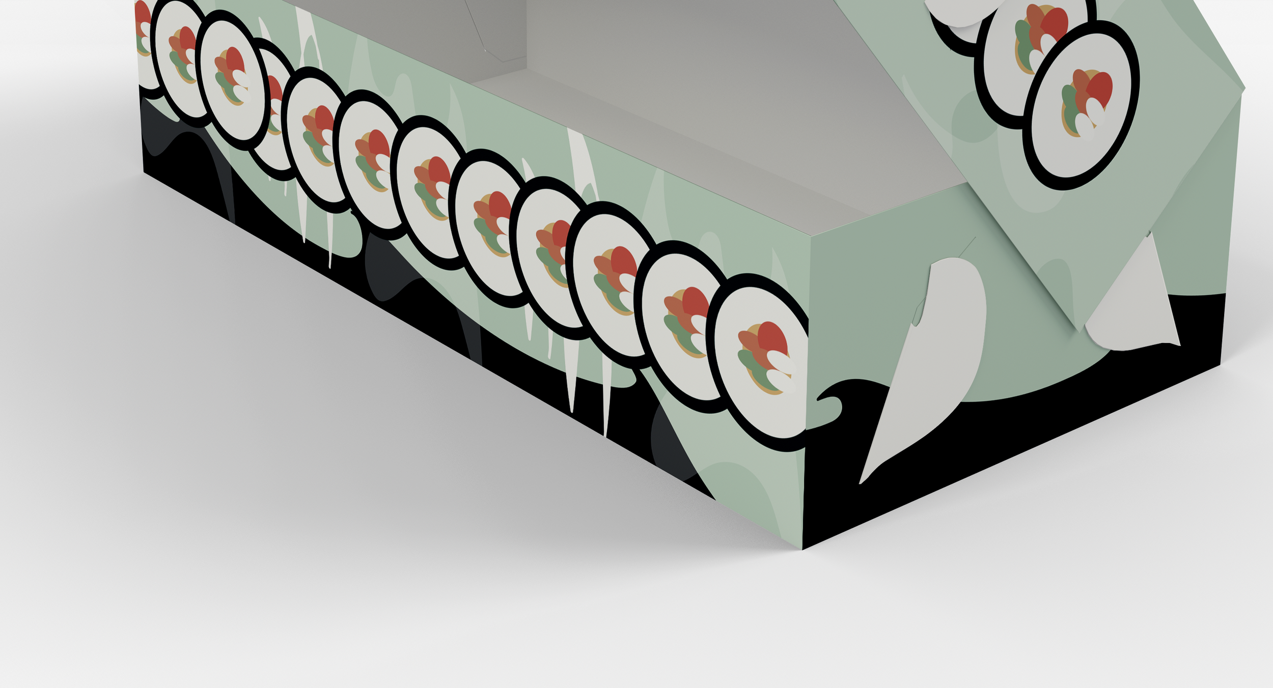
The to‑go packaging became a central part of the process. It needed to feel unmistakably Sushi Square: playful, sustainable, and rooted in their love of sushi culture. I focused on creating packaging that felt engaging and visually memorable — something that would stand out on the street, in someone’s hand, or on a table, while still feeling true to the restaurant’s personality. Sustainability was a key part of the conversation, and the design needed to reflect that commitment without being heavy‑handed.

The merch — t-shirts tied the system together. It allowed the brand to extend beyond the restaurant and become something people could wear, share, and recognise instantly. The goal was to create a visual world that felt cohesive across every touchpoint, from the food to the packaging to the people who love the restaurant.
