David Lowrie Fish Shop
In a small fishing town in Fife, Scotland, there’s a family‑run fish shop that’s been part of the community for over three generations. I loved the company from the moment I met them — the people, the history, the pride they carry in what they do. It’s a traditional business at heart, but what makes them special is the range of people they serve: everyday customers like you and me, and Michelin‑starred restaurants across the country. Balancing those two worlds inside one brand was a joy and a real opportunity.
Client: David Lowrie Fish Shop
Deliverables: illustration, identity, packaging, print and creative direction
Logo mark
The tension was clear: the heritage was rich, but the brand hadn’t evolved with the business. They needed to modernise in a way that understood where they came from, while also stepping confidently into a digital landscape where clarity, trust, and recognisability matter. I wanted the identity to feel warm and rooted in community, but also strong enough to stand beside the best chefs in the country. Whether you’re buying dinner for your family or plating a dish in a restaurant, the brand needed to feel like something you could trust.

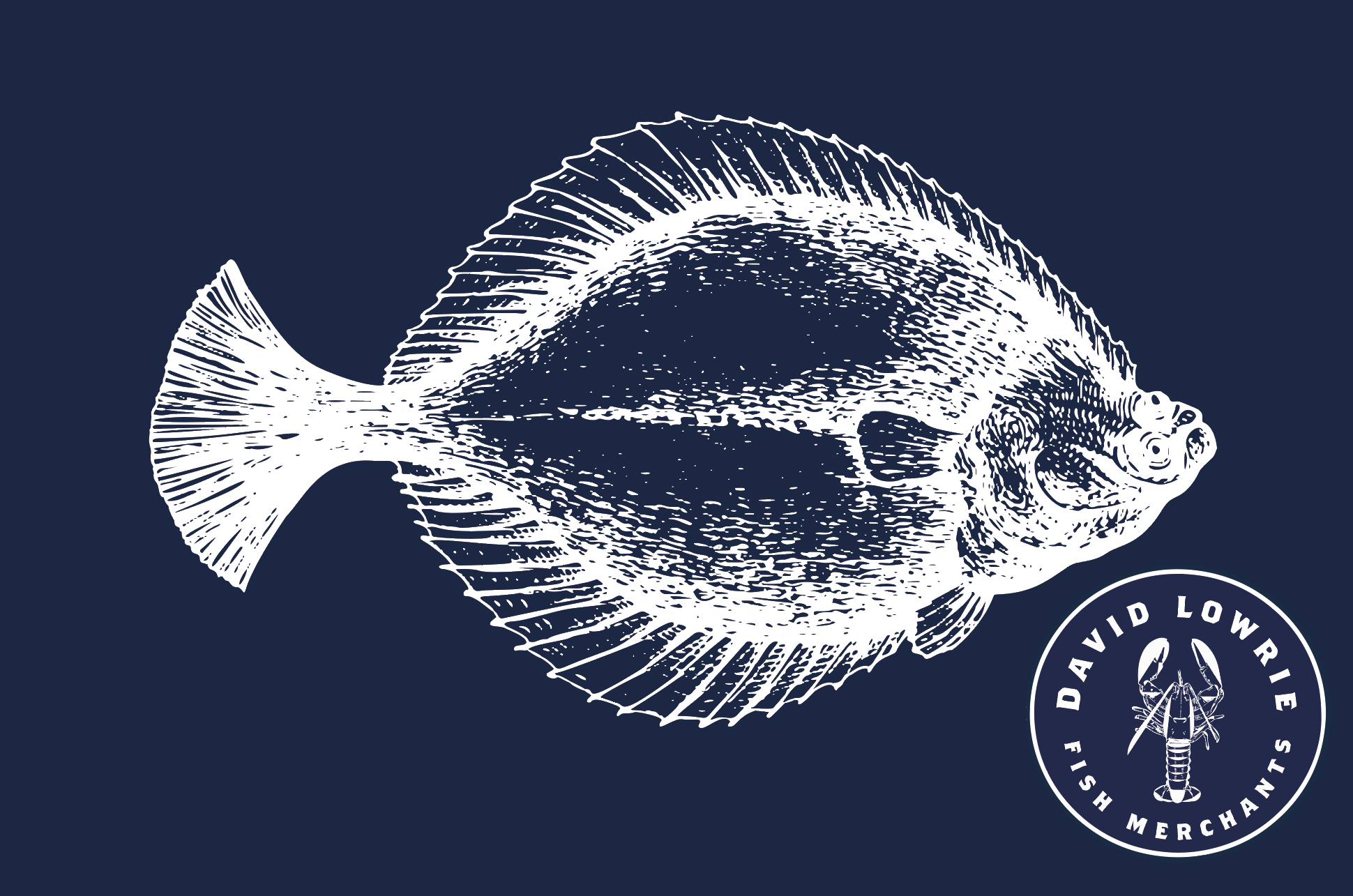


Promotional print postcards for clients
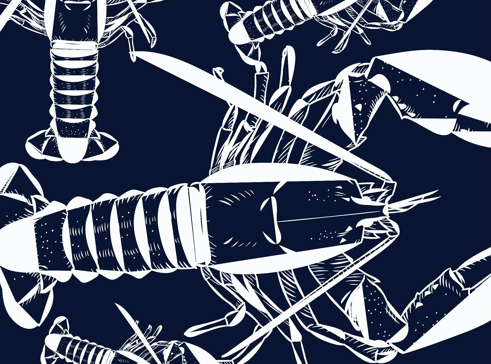
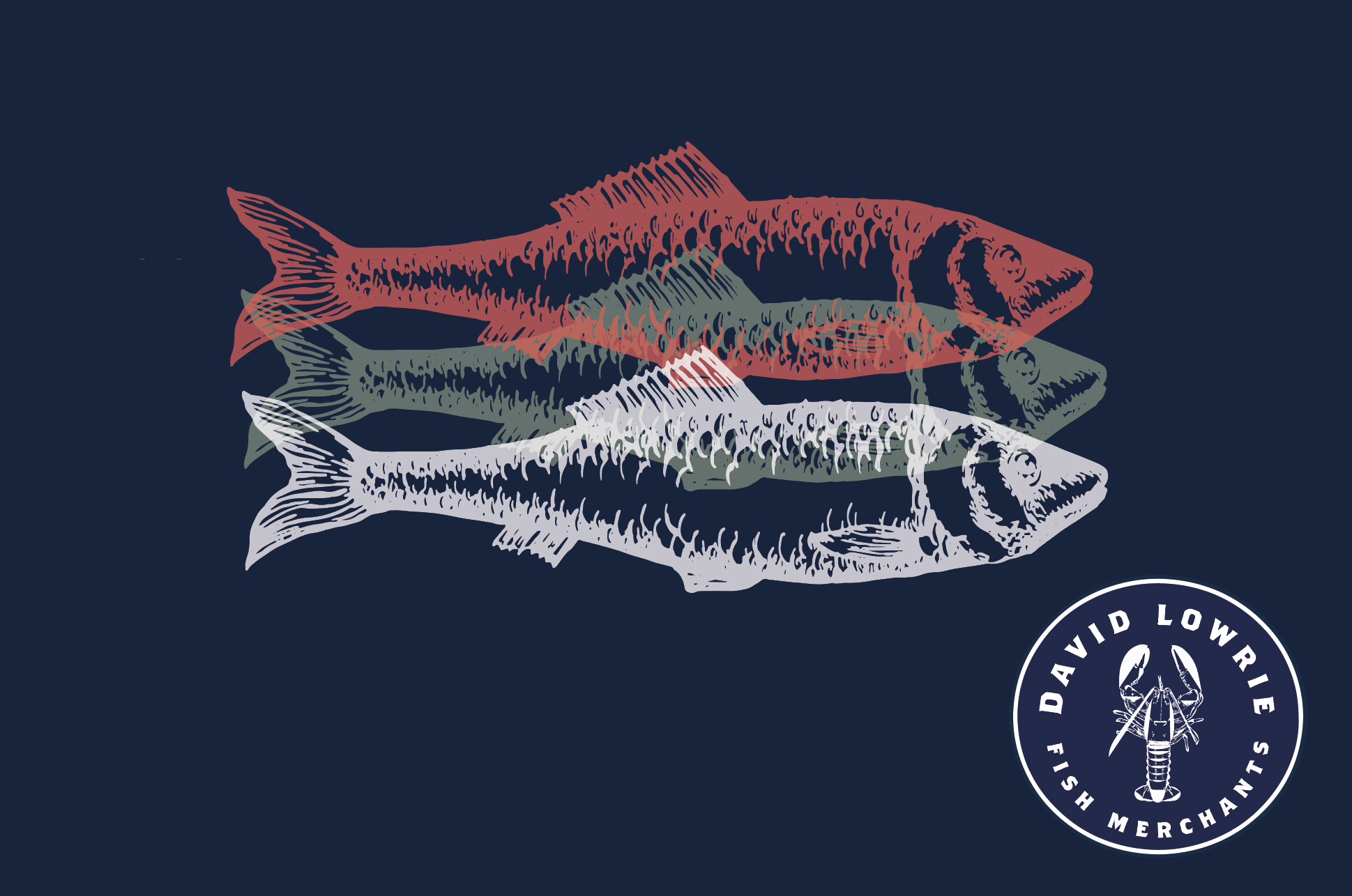
My favourite part of the process was digging into their origins — their Scottish roots, the colours and textures of the town, the stories that shaped the shop. Those details guided everything: the colour palette, the type direction, the illustration style. The goal wasn’t to strip away their history, but to make it feel alive in the brand world. The illustration details mattered deeply to them, and bringing those to life in a way that felt both traditional and contemporary was a highlight.
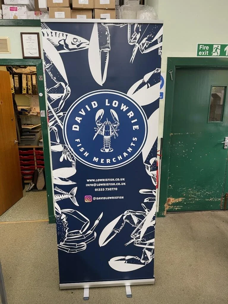
Promotional Print Banner