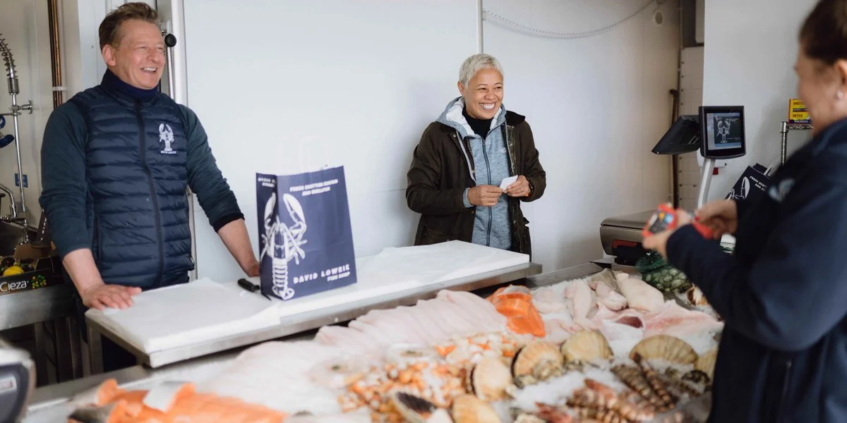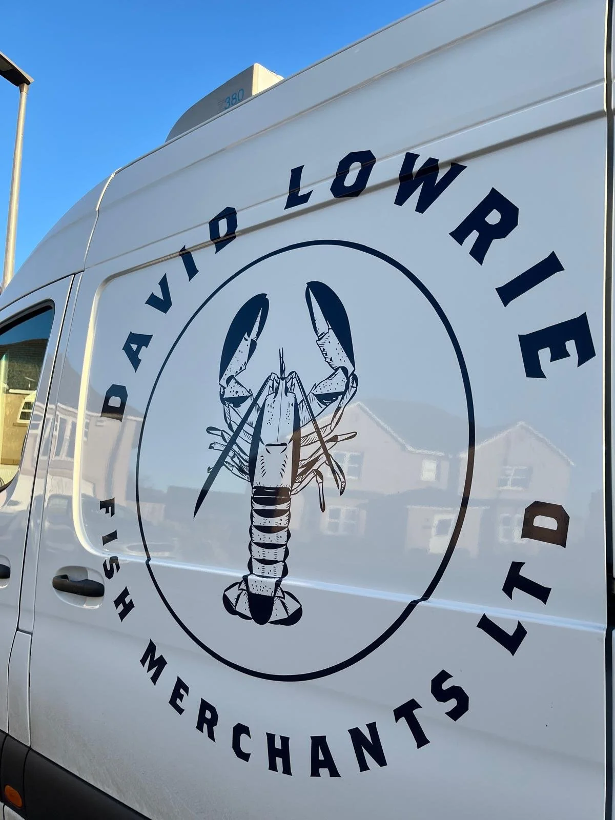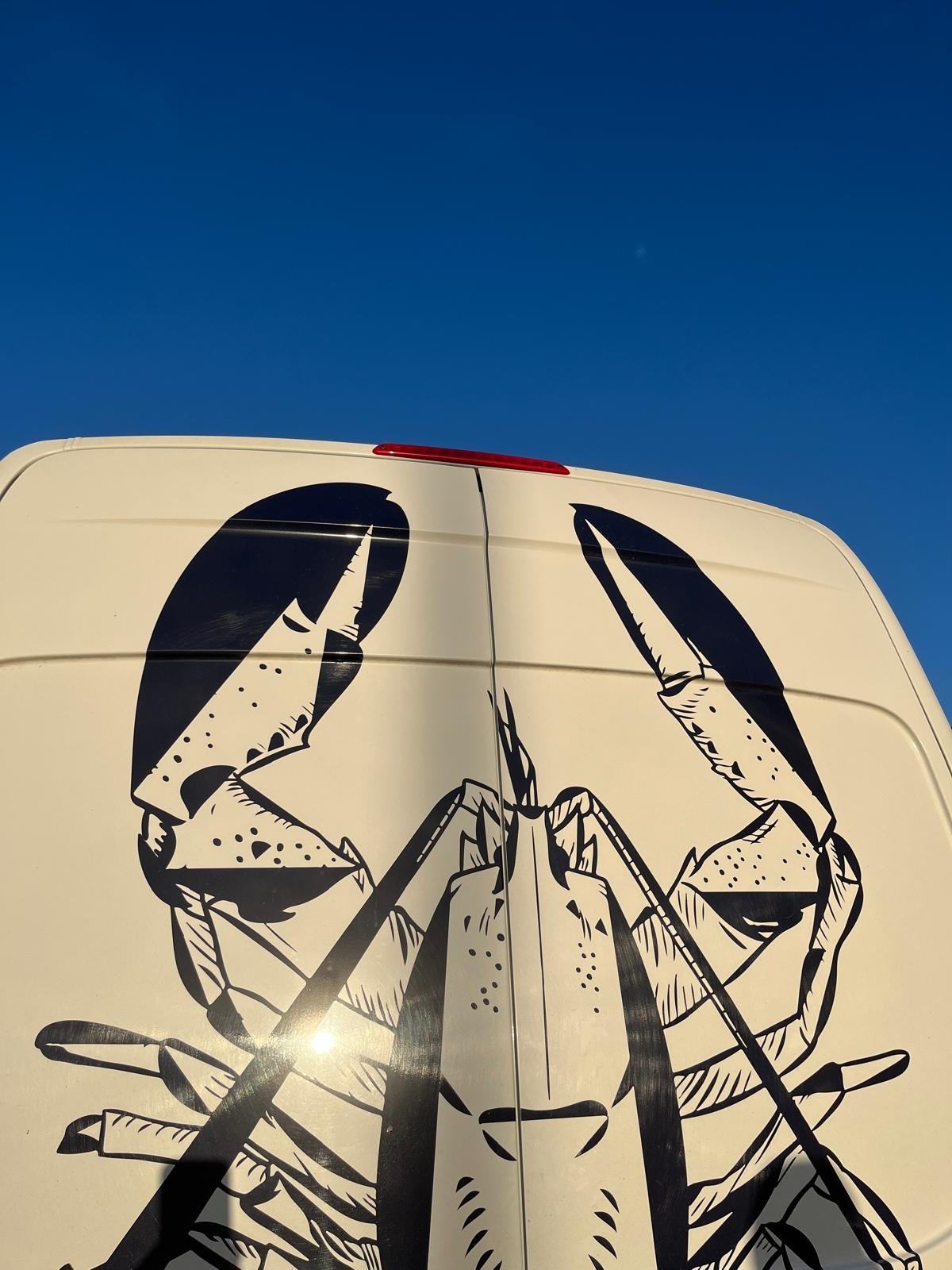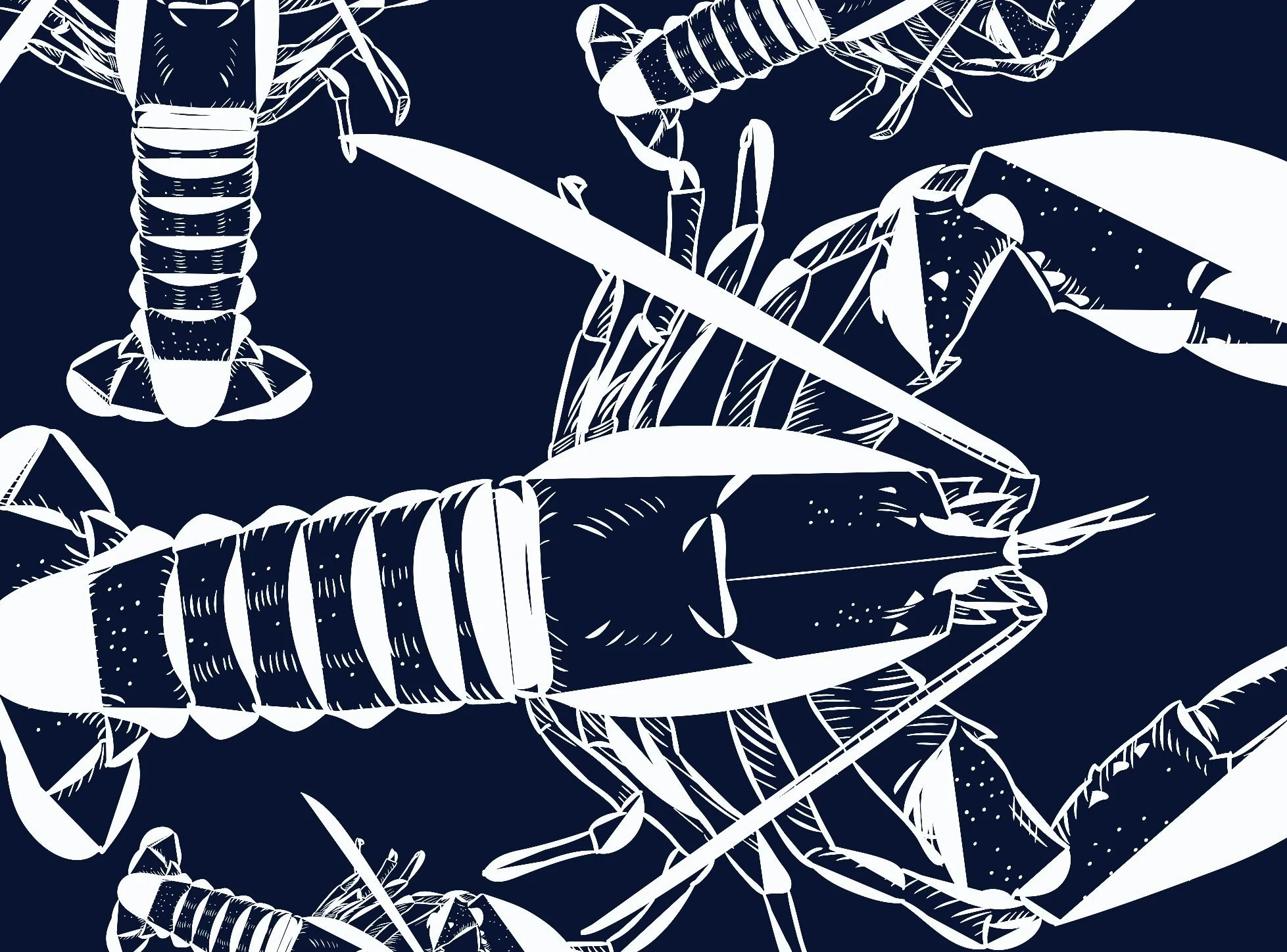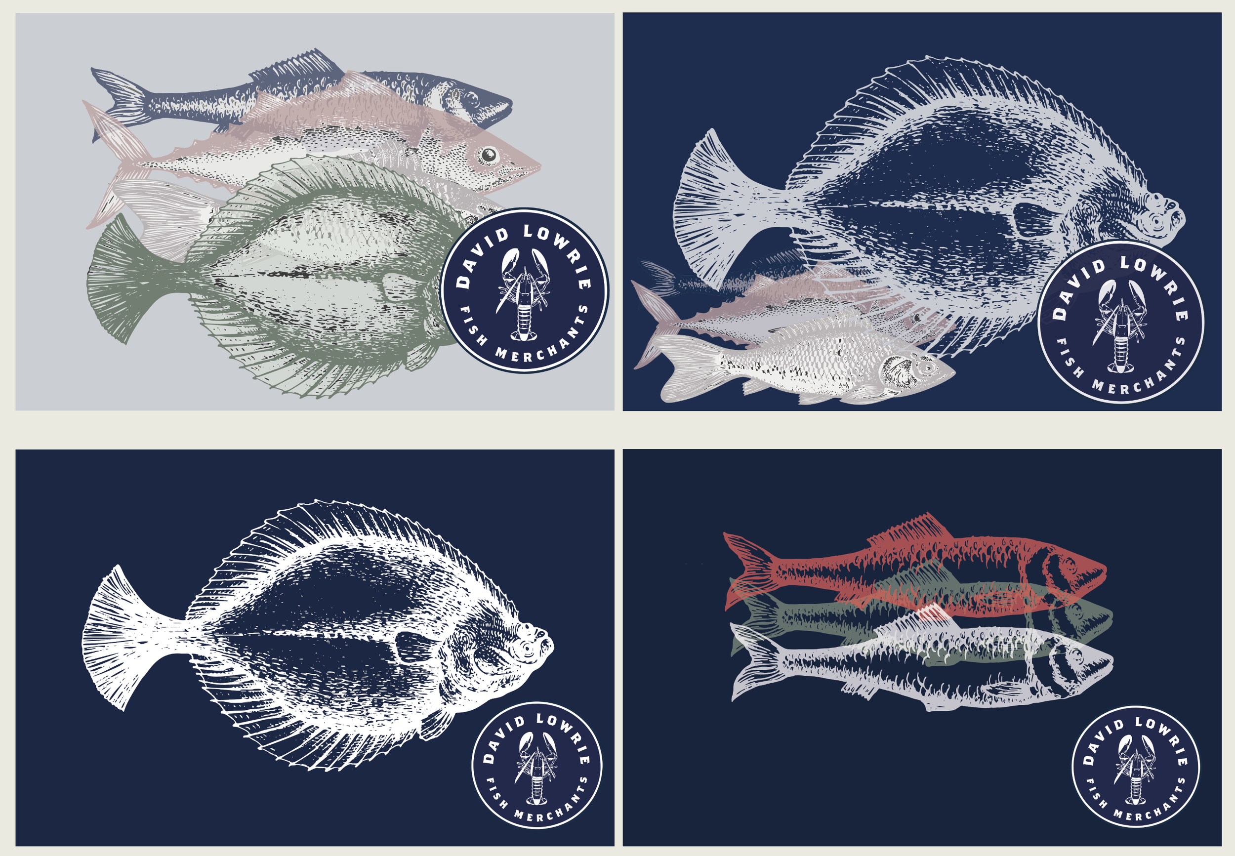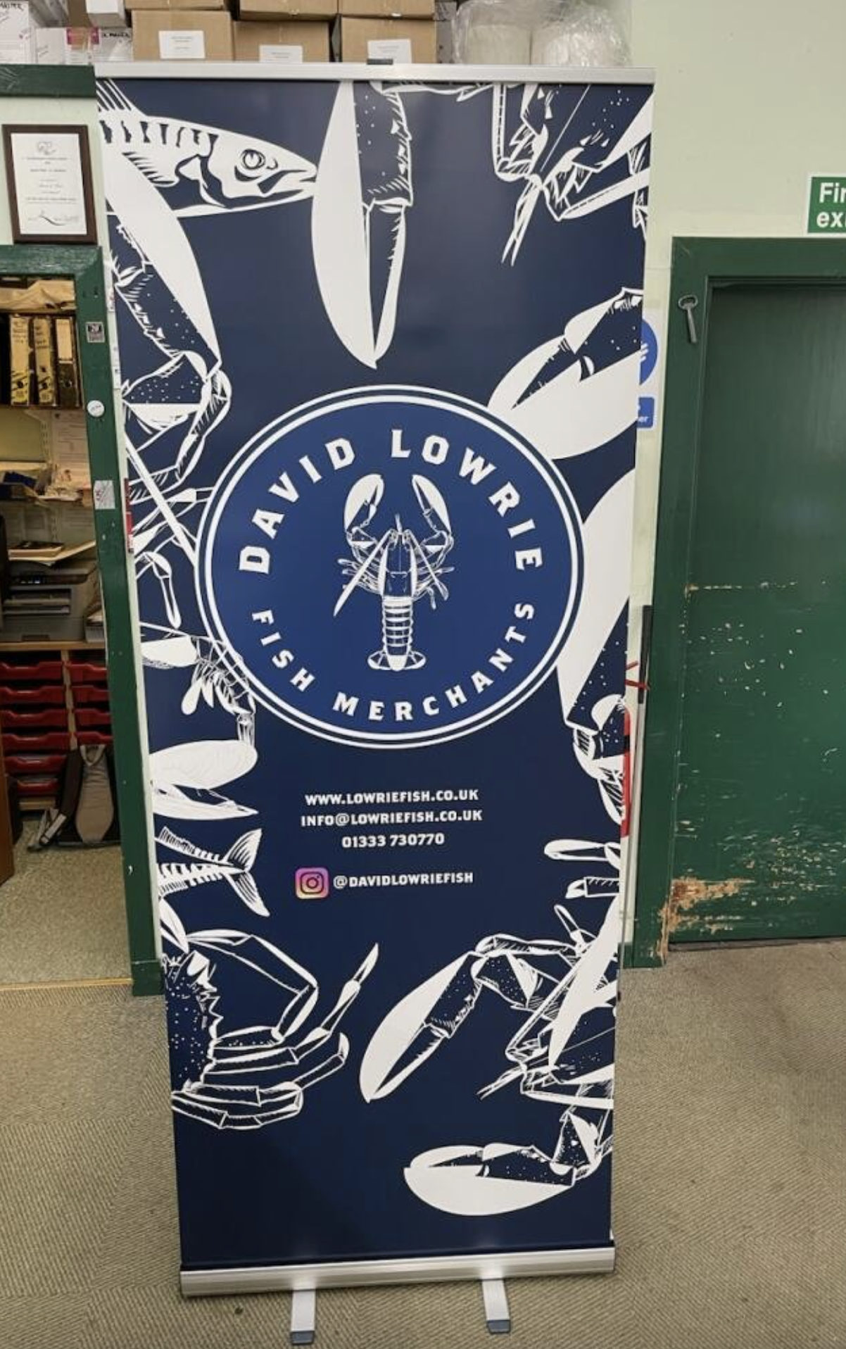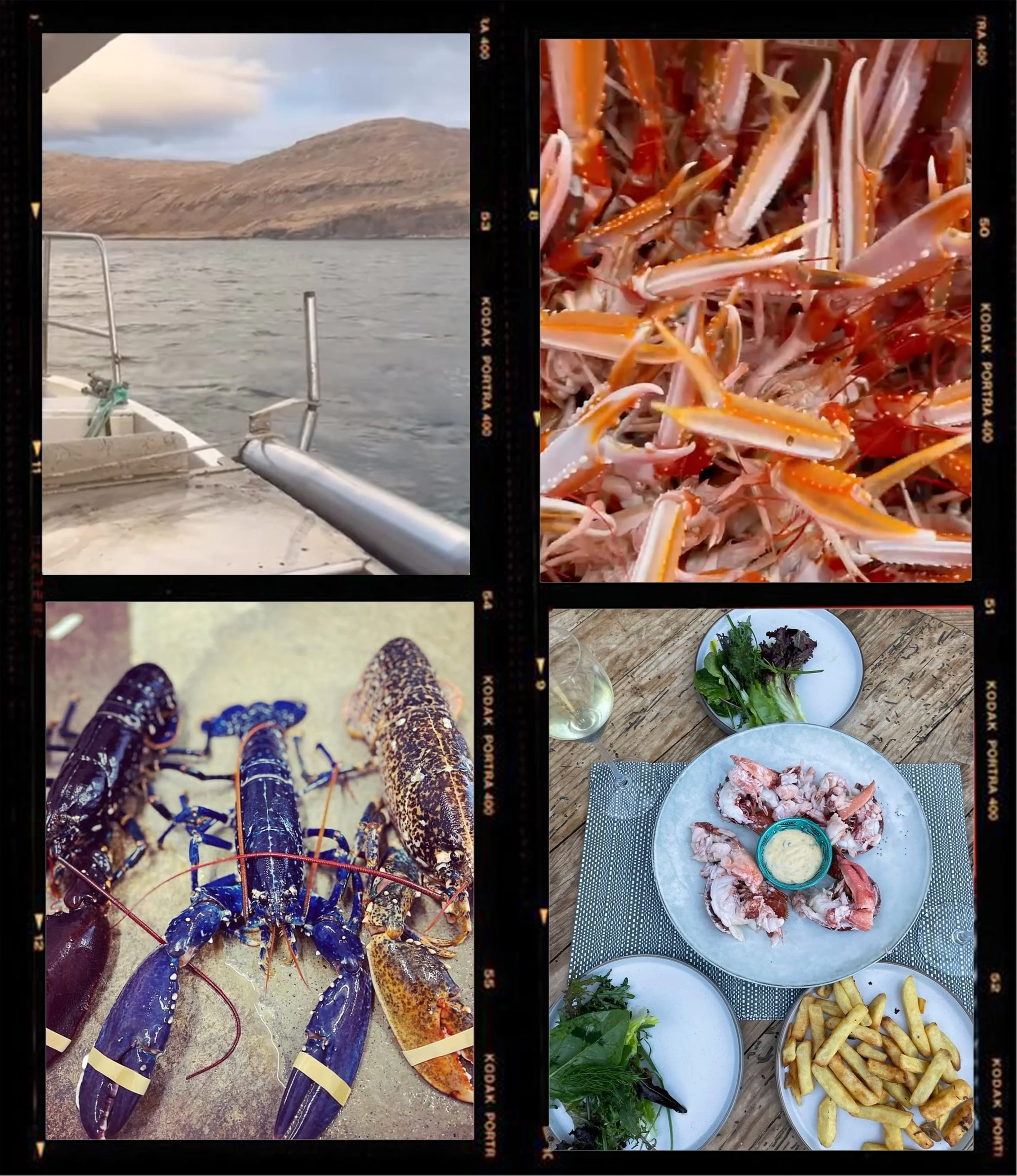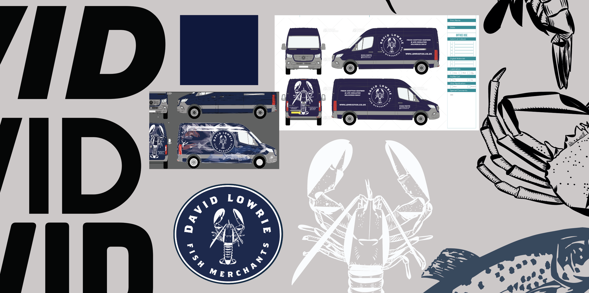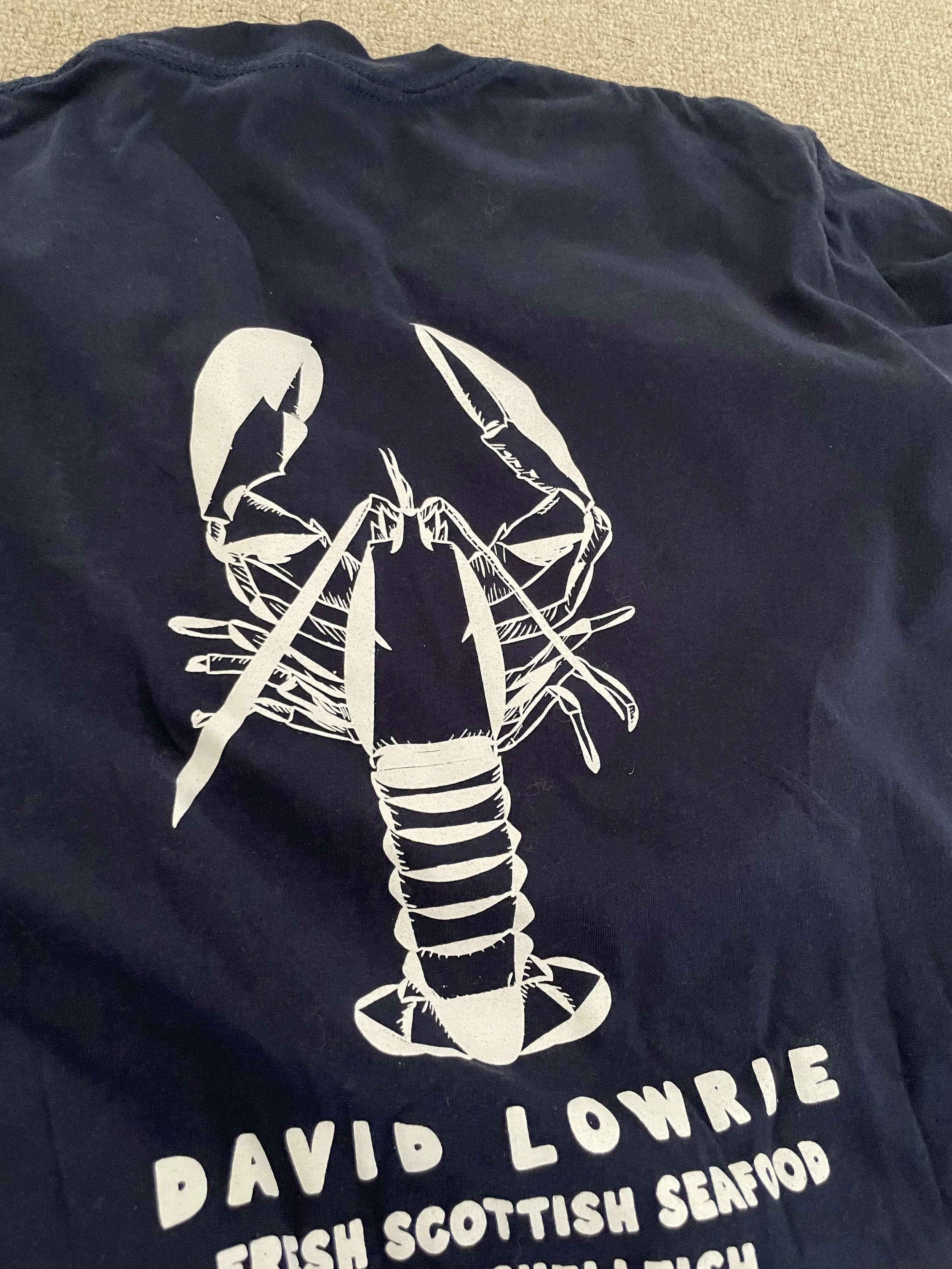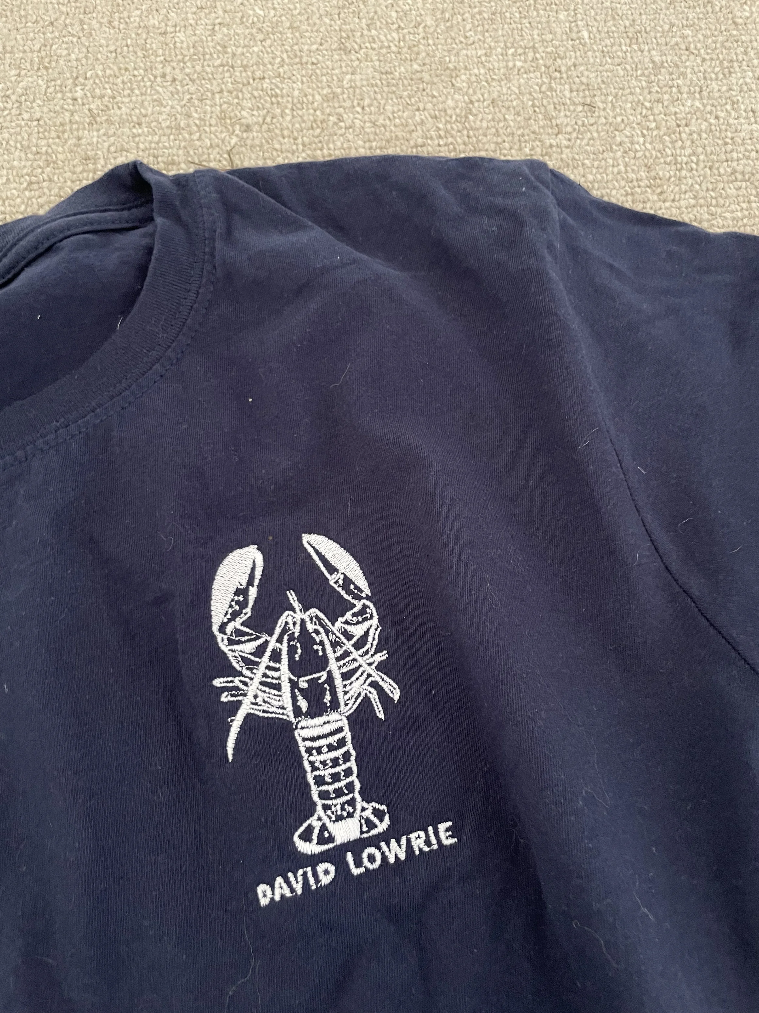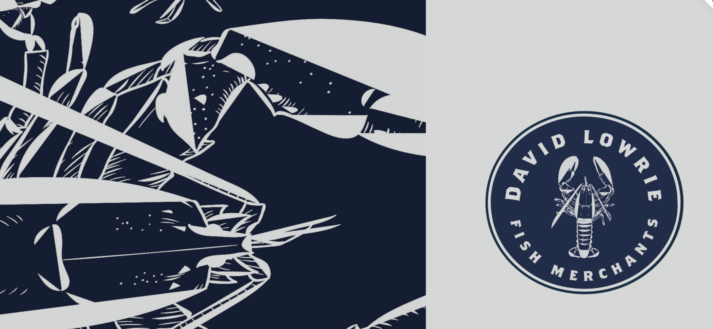
At the heart of the new identity is a visual system built to handle duality. We created a custom lobster illustration that acts as a seal of authority — not just a logo, but a stamp of quality, equally at home on a 20kg crate of langoustines or a high-street carrier bag.
ATMOSPHERIC CUES
Beyond the mark, the brand is expressed through tactile packaging — considered bag design, and a verbal identity that is direct, honest, and communicates craft and expertise.
DAVID LOWRIE
Industry
Food and Drink
Action
Brand Positioning and Narrative, Visual Signage, Iconography and Visual Identity
Every touchpoint was re-engineered to communicate provenance — from the clinical typography of wholesale invoices to the tactile, oversized graphics on the distribution fleet. The goal was to ensure that whether the brand appeared in a Michelin-starred kitchen or a local driveway, the signal of “elite craft” remained unbroken.
THE IMPACT
Since launching the new identity, David Lowrie has transitioned from a supplier to a destination. Customers began noticing the brand before the product — asking for it by name, recognising the mark on sight, and treating it as a signal of quality in its own right. What was once a trusted supplier has become a brand people actively seek out.